Redesigning Hawaiʻi State Public Library website
Visual Design, UXUI, Low&High-fidelity Wireframe
Overview
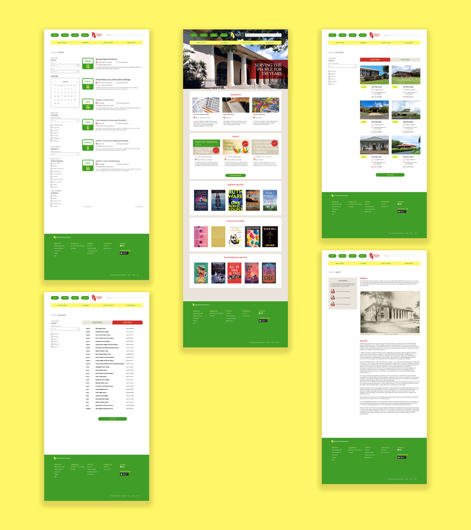
This project aims to suggest redesigning the Hawaiʻi State Public Library(HSPL) website and creating a more accessible platform.
The history of HSPL is deeply intertwined with Hawaiʻi’s broader educational and cultural development. The institution’s origins can be traced back to the late 19th century, with the establishment of the Honolulu Library and Reading Room in 1879. Hawaiʻi’s royalty (King Kalākaua, Queen Kapiʻolani, Queen Emma, and Princess Bernice Pauahi Bishop) supported this both physically and financially.
Design Decision
The objective is to create a user-centered website that provides easy, intuitive access to various resources and services, including online catalogs, digital collections, event calendars, and library information.
The website should support the library’s mission of promoting literacy, lifelong learning, and community engagement by offering a seamless digital platform that connects users with educational and informational materials regardless of location or device. Ultimately, the goal is to extend the library’s reach and impact by making its resources more accessible, engaging, and valuable to the diverse needs of its community.
Challenge—Defining the issue
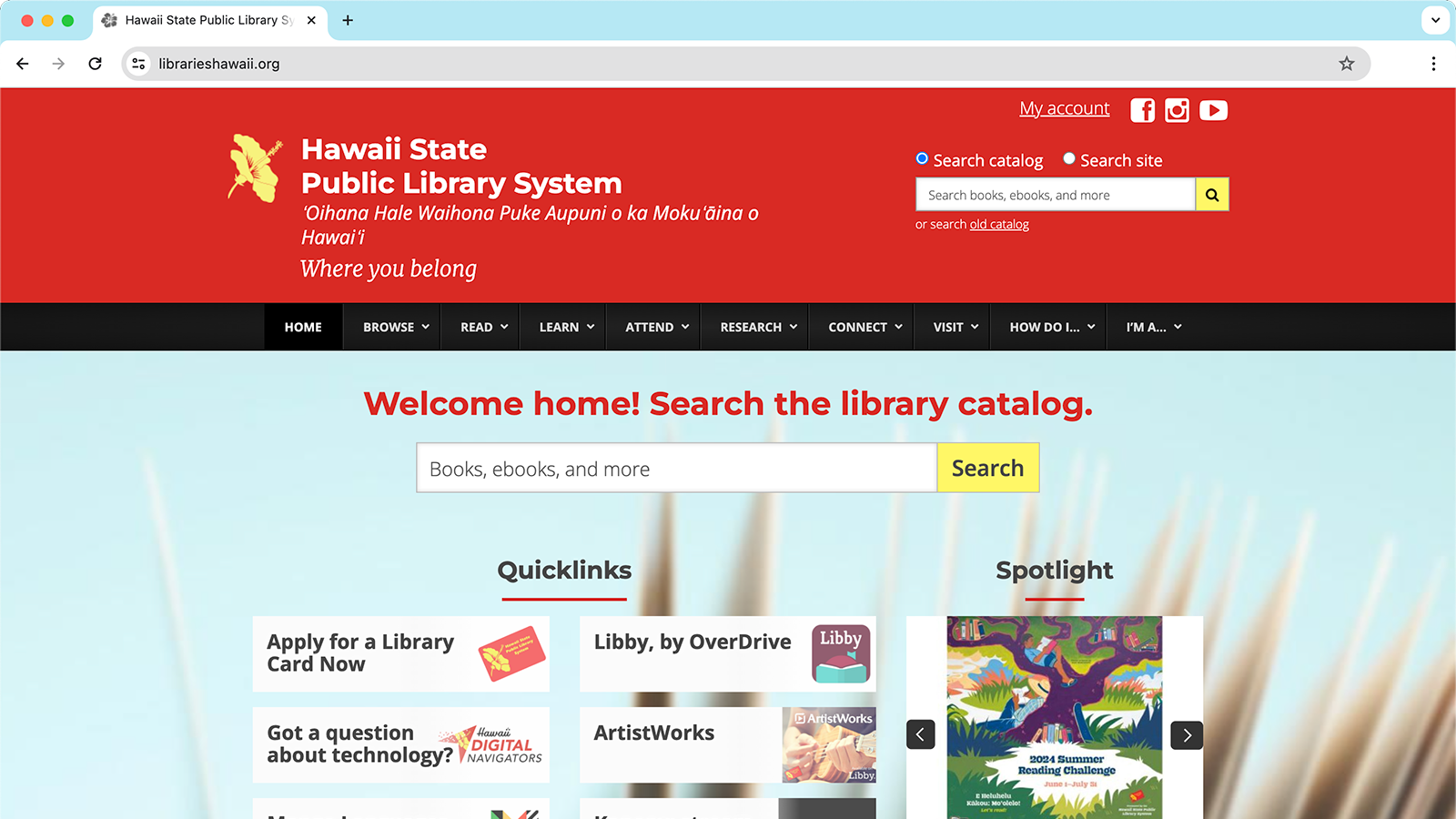
The current website (as of June 2024) shown above has several issues that come from the same root—a complex information architecture. While the library serves the entire state, it is reasonable to contain a vast amount of information. The issue is that it lacks a user-centric perspective.
- Lack of visual hierarchy complicates navigation.
- Graphics are not communicating (distracting).
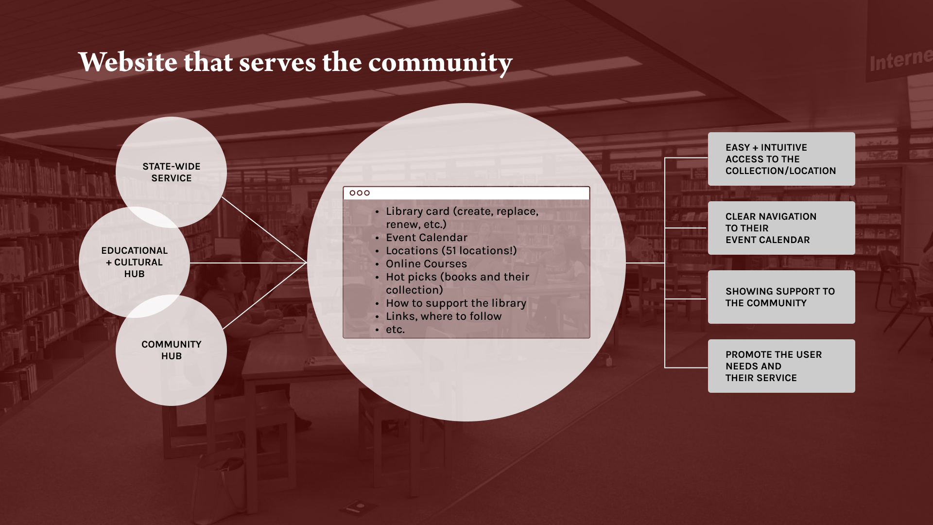
- he library works as an educational + cultural + community hub, but the website does not promote these.
Challenge—Defining the solution
To solve these issues, I clarified the objectives of this project.
- The website should be a user-centered platform that provides library service access.
- The website should be able to navigate easily and intuitively.
- The website should support the library’s mission of promoting literacy, lifelong learning, and community engagement.
- The website should feel open to everyone.
User Demographic and User Personas
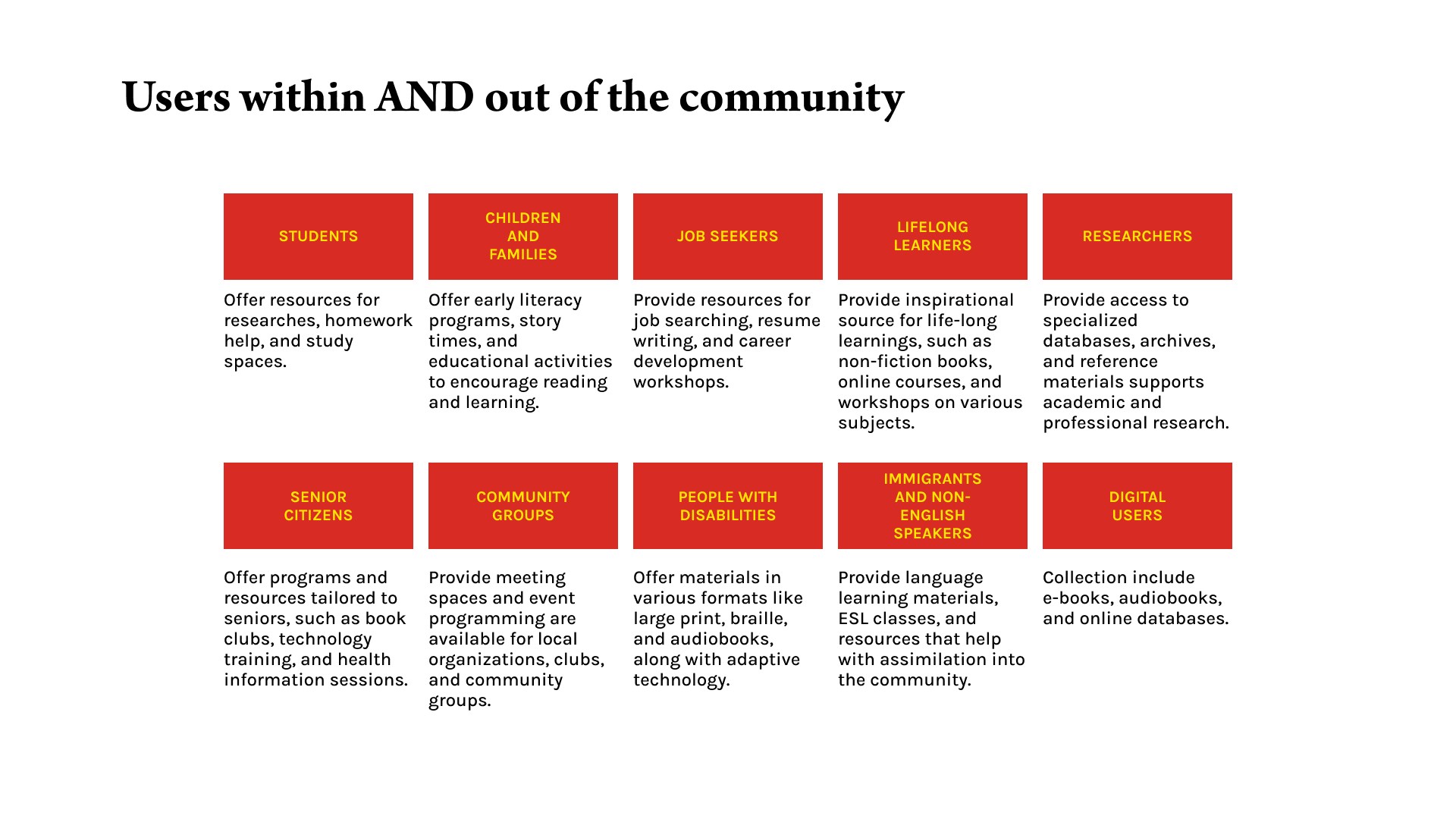
As the project aims to design a user-centric website, defining the users was also a big piece of the puzzle. I had conversations with potential library users and asked what they would be looking for in library service. Their first questions were:
- Which branch can I go to?
- How can I get a library card?
- TWhat do they do?
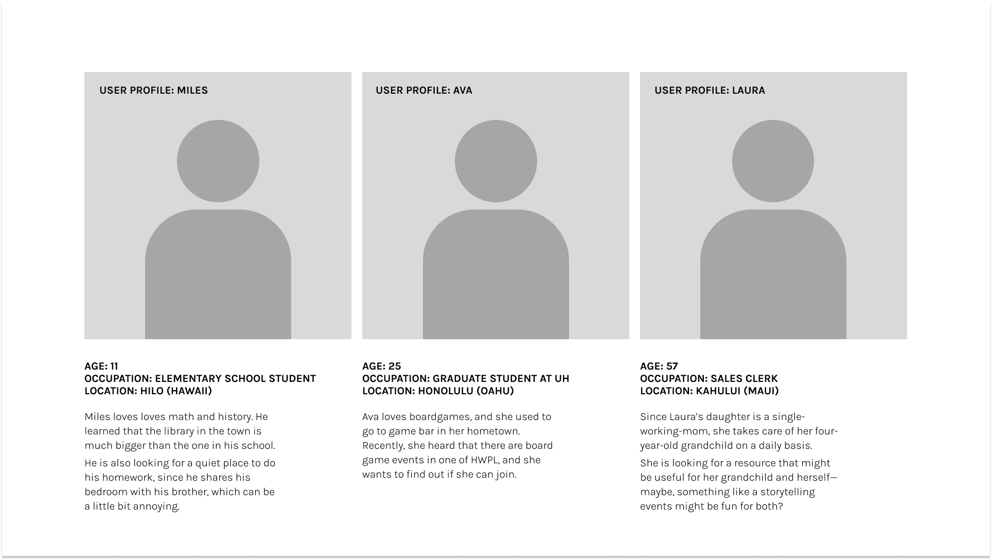
After creating a list of user demographics, I created three profiles to help create a better platform accessible to users. This process helped me better understand the library service itself, how it should be supported, and what the end goal should look like.
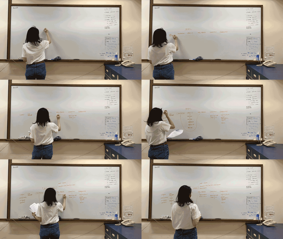
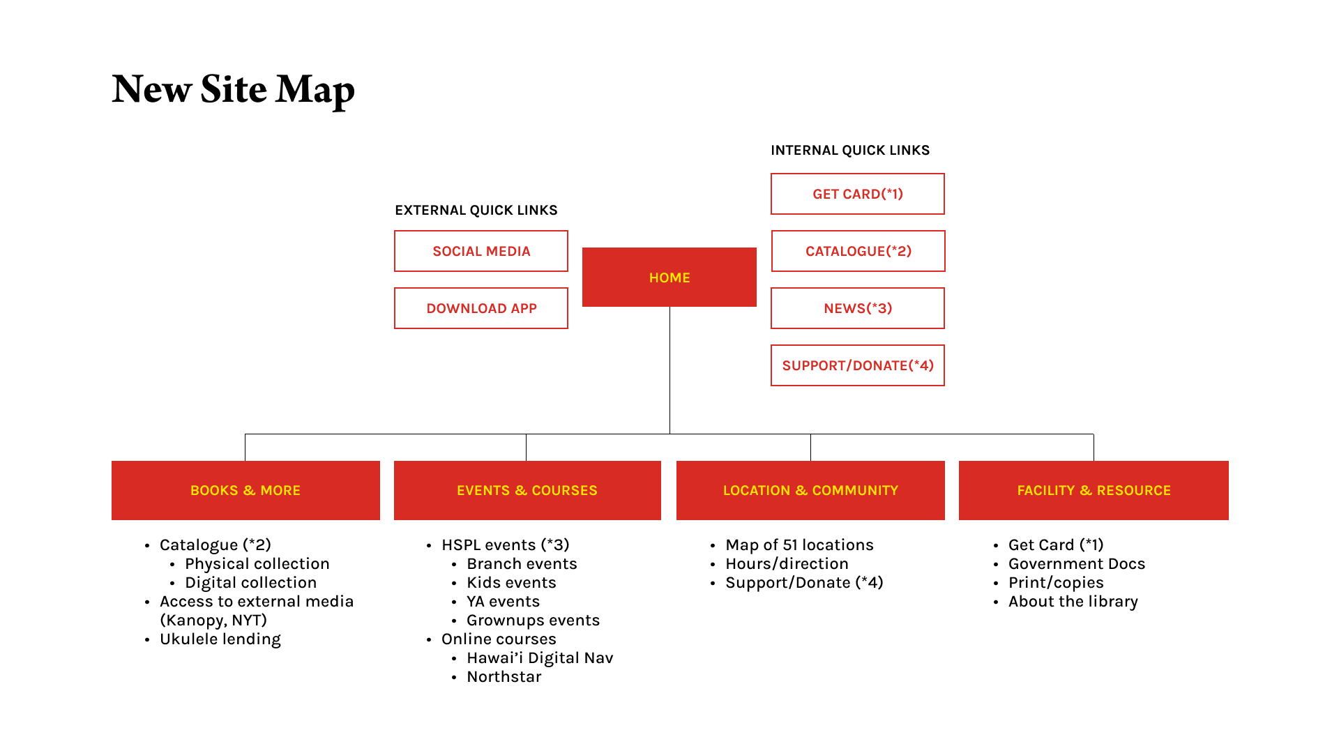
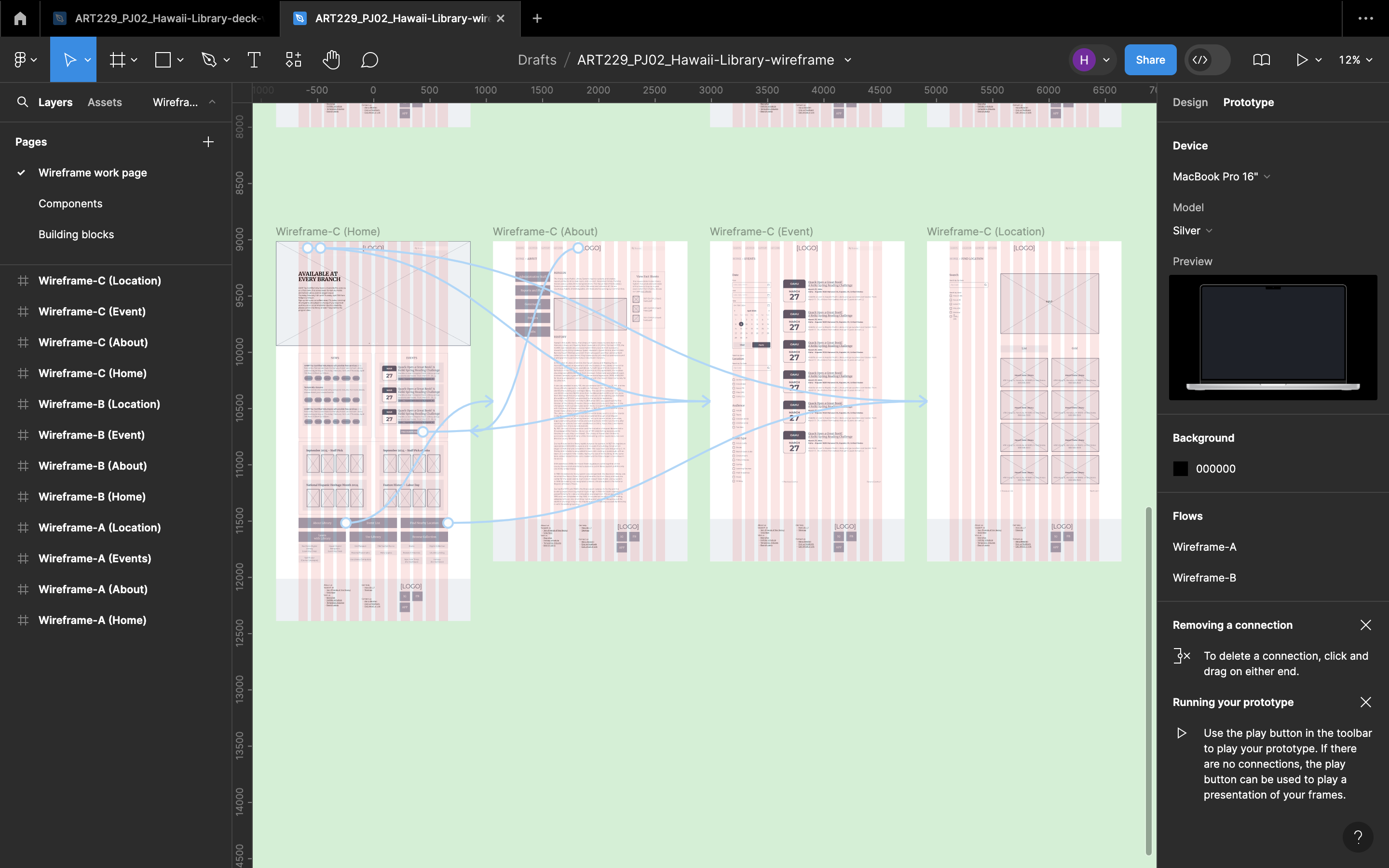
A new site map, wireframing, and ideation
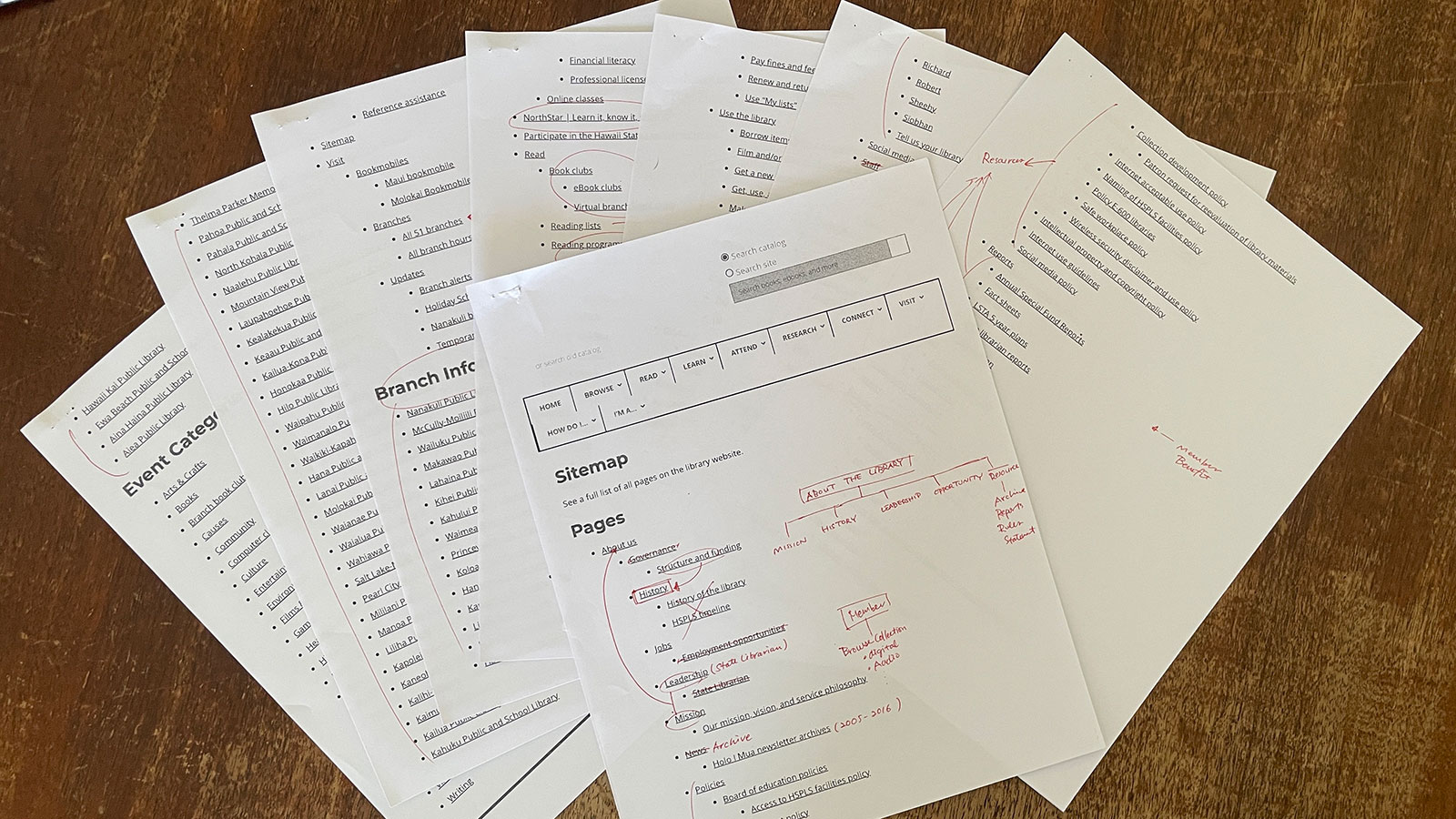
Based on the learnings above, I explored the information architecture and created a new site map based on user needs.
