Website Refresh for
150-year-old library
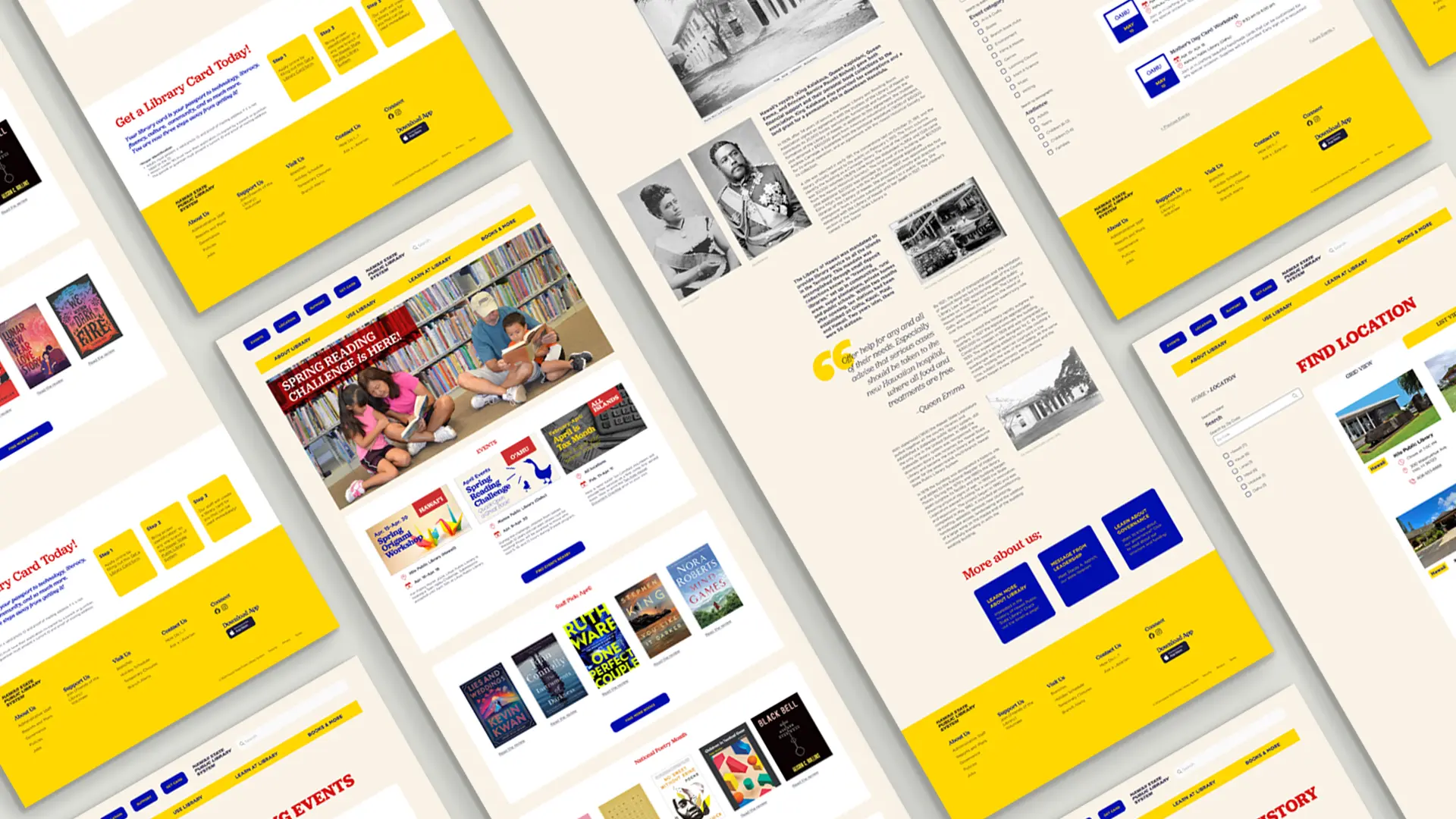
Redesigning Hawai‘i Public Library Website
Visual Design (UI), UX Research
Overview
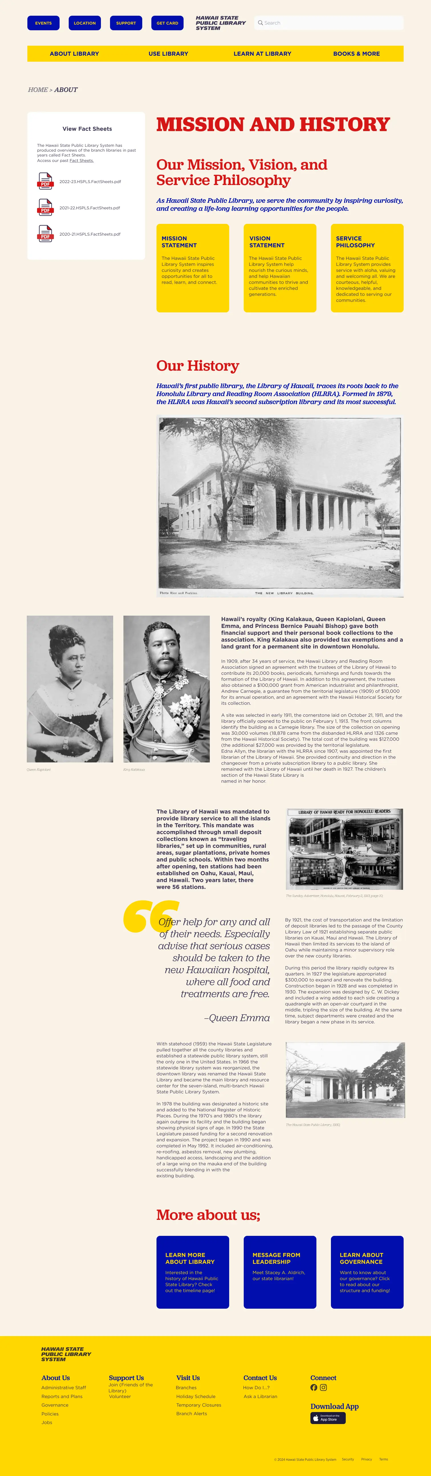
The history of the Hawai‘i State Public Library System (HSPL) is deeply intertwined with the broader educational and cultural development of Hawaii‘i. Its origins date back to 1879 with the establishment of the Honolulu Library and Reading Room, which was supported both financially and physically by Hawaii‘ii’s royalty, King Kalākaua, Queen Kapii‘olani, Queen Emma, and Princess Bernice Pauahi Bishop.
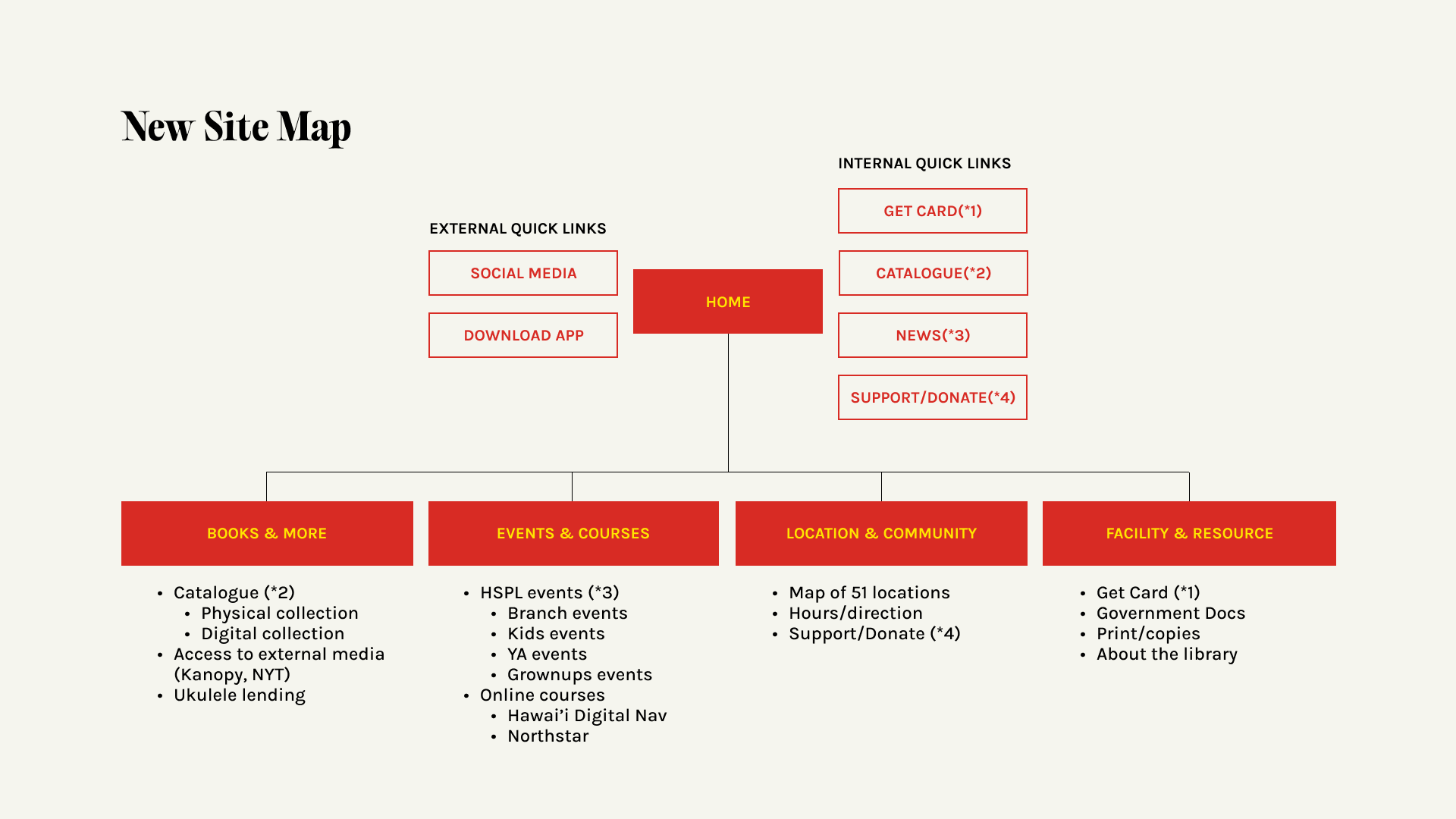
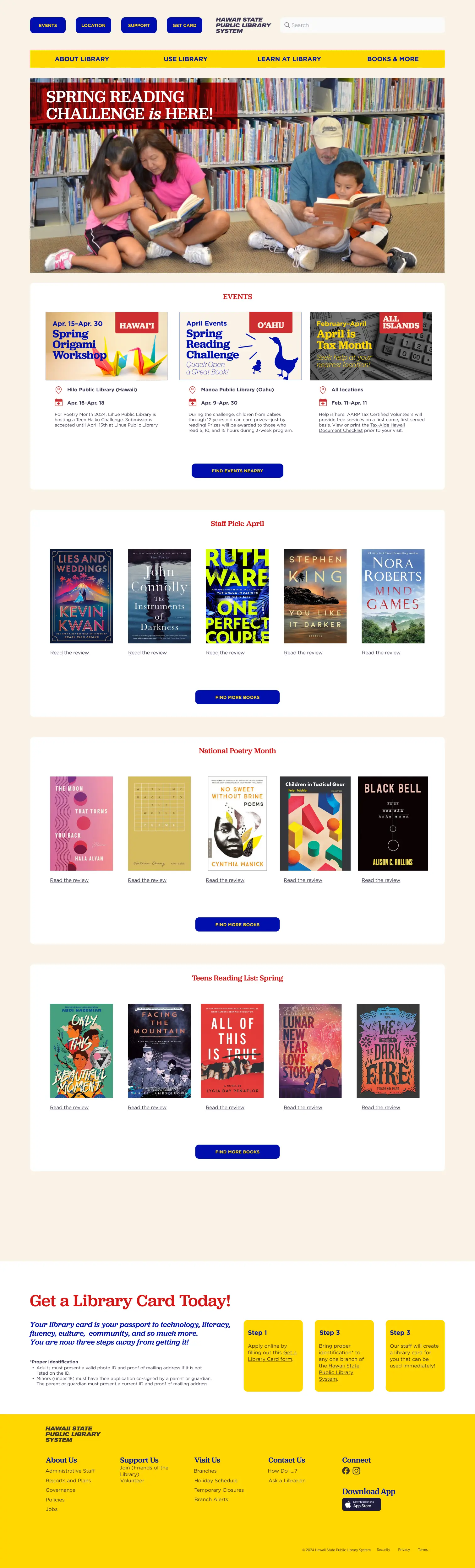
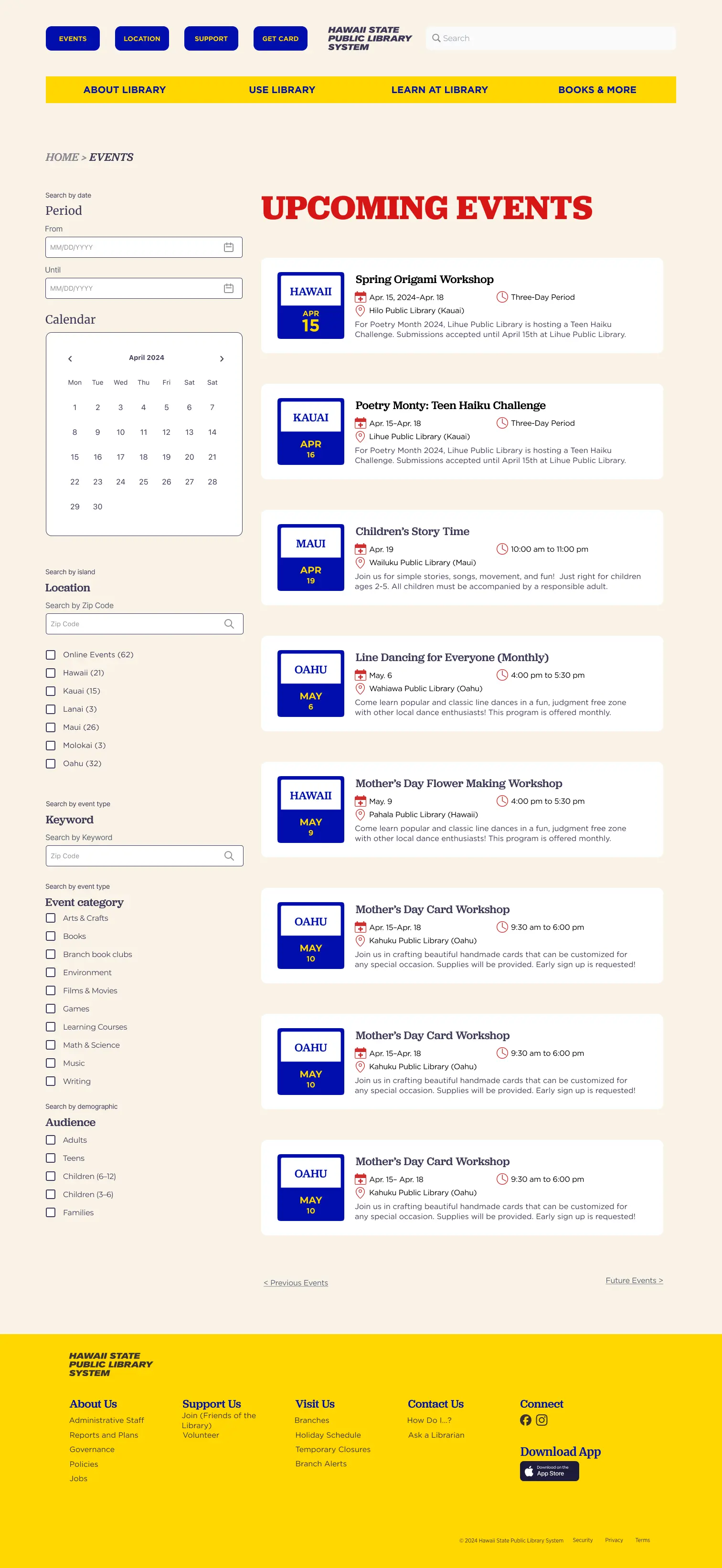
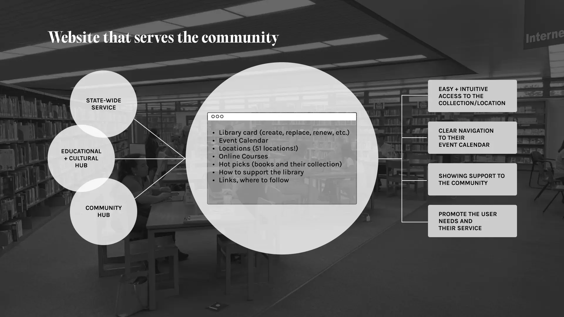
The primary goal of this project is to design a user-centered website that provides intuitive access to essential resources and services, including event calendars and library information.
Challenge
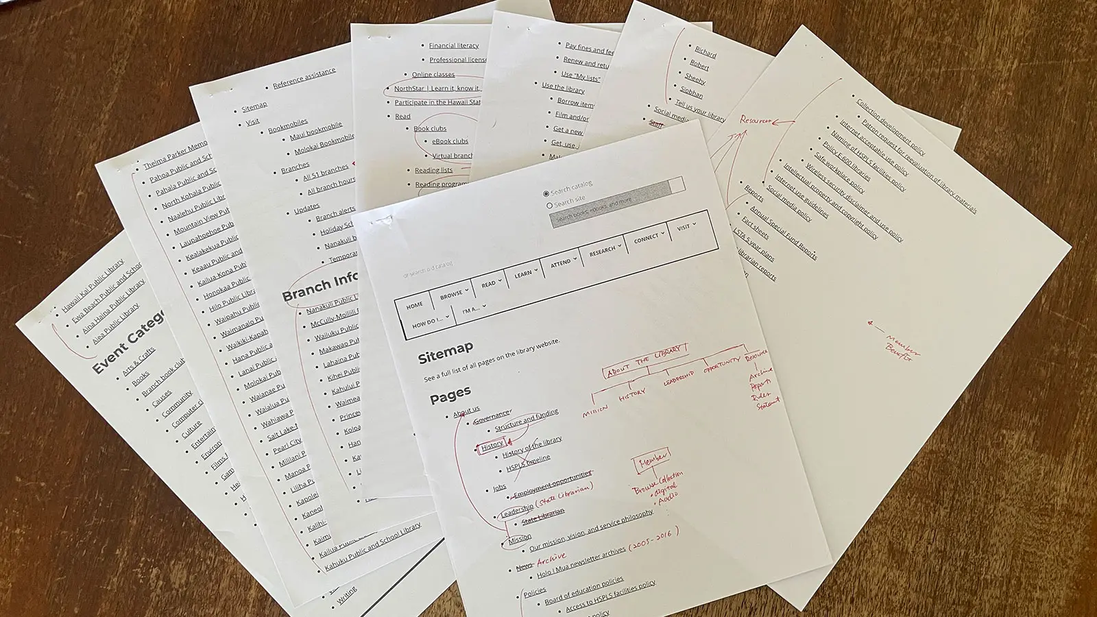
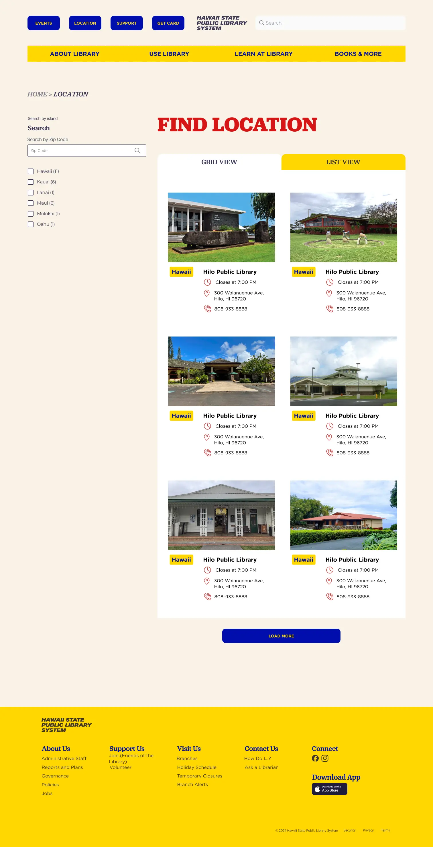
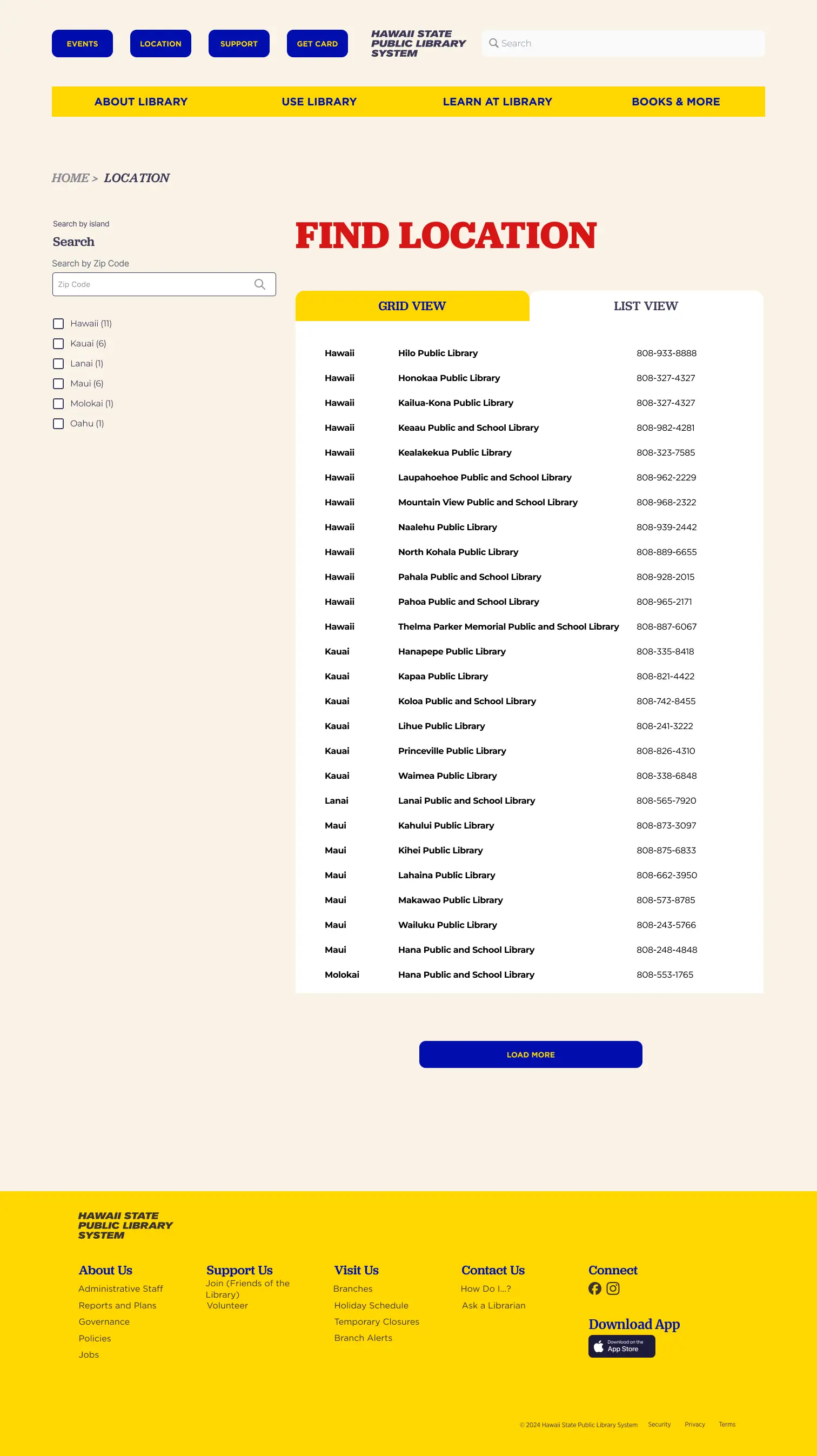
The current website (as of June 2024) suffers from a fundamental issue: a complex and overwhelming information architecture.
While it makes sense for a statewide library system to contain vast amounts of information, the site currently lacks a user-centric perspective.
Key challenges include:
Poor visual hierarchy, which makes the users navigate the site difficult.
Ineffective graphics that distract rather than enhance communication.
Limited identity representation, failing to highlight the library’s role as an educational, cultural, and community hub.
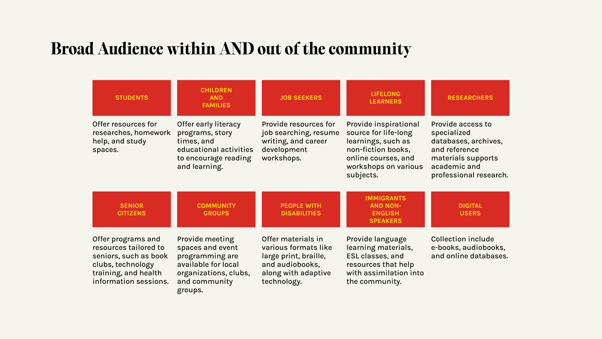
User Demographic
Because this project was built around user needs, it was essential to define the audience. I conducted conversations with potential users to understand their priorities. The most common questions they had were:
- Which branch can I visit?
- How can I get a library card?
- What services does the library offer?
User Personas
Based on these insights, I developed three user personas to guide the design process. This approach helped refine the website’s structure, ensuring that the platform not only supports library services but also aligns with the real needs of its users.

User name: Laura
Age: 57
Occupation: Sales Clerk
Location: Kahului (Maui)
Since Laura’s daughter is a single mom who works full-time, she takes care of her four-year-old grandchild on a daily basis.
She is looking for a resource that might be useful for her grandchild and herself—maybe something like storytelling events might be fun for both.

User name: Miles
Age: 10
Occupation: Elementary school student
Location: Hilo (Hawaii)
Miles loves loves math and history. He learned that the library in the town is much bigger than the one in his school and might have more advanced books in those disciplines.
He is also looking for a quiet place to do his homework since he shares his bedroom with his brother, which can be a little bit annoying.

User name: Ava
Age: 25
Occupation: Grad student at UH
Location: Honolulu (Oahu)
Ava loves board games, and she used to go to a game bar in her hometown. Recently, she heard that there are board game events in one of the HSPLS branches, and she wants to find out if she can join.
Ava is willing to drive to any location on the island, but she needs to know the parking situation.